

|
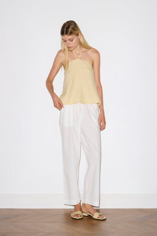
Colour Story: Butter | Deiji Studios A soft glow, the warmth of first light, filtering through linen curtains, casting a quiet radiance over slow mornings. Butter is the colour of hush and harmony, where time stretches long and unhurried. A hue drawn from nature’s gentle moments, the delicate petals of chamomile, the golden rind of aged linen, the soft glow of afternoon light settling on sun-warmed skin.
|
  |
|
|
|


|
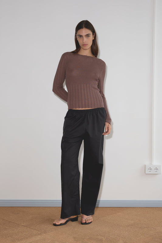
As the season turns, Butter takes on new forms. Fluid and unstructured, crisp and refined. Found in airy linen sets, effortless layers, and everyday essentials, it brings a sense of warmth and ease to the familiar.
|
  |
|
|
/ Lottie in the Linen Wrap Back Top in Butter Yellow // Anna L Wolcott via Pinterest // “T” Chair, 1952 // Laila La La via Pinterest // Deiji Studios outtake // David Payne via Pinterest / |